Proven in the ICU. Invisible everywhere else.
Heart AI's Critical Care Informatics System has been in daily use in a major public health network since 2022, alongside tools for clinical coding, patient flow and registry reporting. The work was real. The name and the presence weren't keeping up.
The company needed a name it could own, an identity that felt clinical without feeling cold and a website that could speak to clinicians, health executives, digital teams and investors without losing any of them.

The name, spelled in signal.
The mark is the word Phycera written in Morse code. Each of its seven columns is one letter: short blocks are dots, tall blocks are dashes. Read from right to left, it spells P, H, Y, C, E, R, A.
Morse is the original way of turning a message into data, which suits a company whose whole job is making data readable. A line of mint blocks climbs through the columns like a good result on a chart.
Clinical, never cold.
A palette taken from the hospital itself: the deep navy of scrubs, the blue of a monitor at night, the pale wash of a ward in morning light. Mint is used sparingly, the way a good result shows up on a chart.
People in front of the data.
The signature device. Photographs are rebuilt as a field of small square pixels, with a clean cut-out of the person laid exactly on top. Around it, the photography is real clinical settings, lit low and cool, with people always closer to you than the screens.


Superpowers,
not autopilot.
Healthcare doesn't need technology that replaces clinicians. It needs technology that gives them time back. Every decision in the brand and the site came back to that idea.
One platform, five applications.
phycera.com lays out the platform in plain language: connect, structure, present and protect. Each application gets its own page, alongside the governance and data security detail health services need before they'll take a meeting.
Real product screens sit next to the pixel imagery, so the site shows the software rather than just describing it.
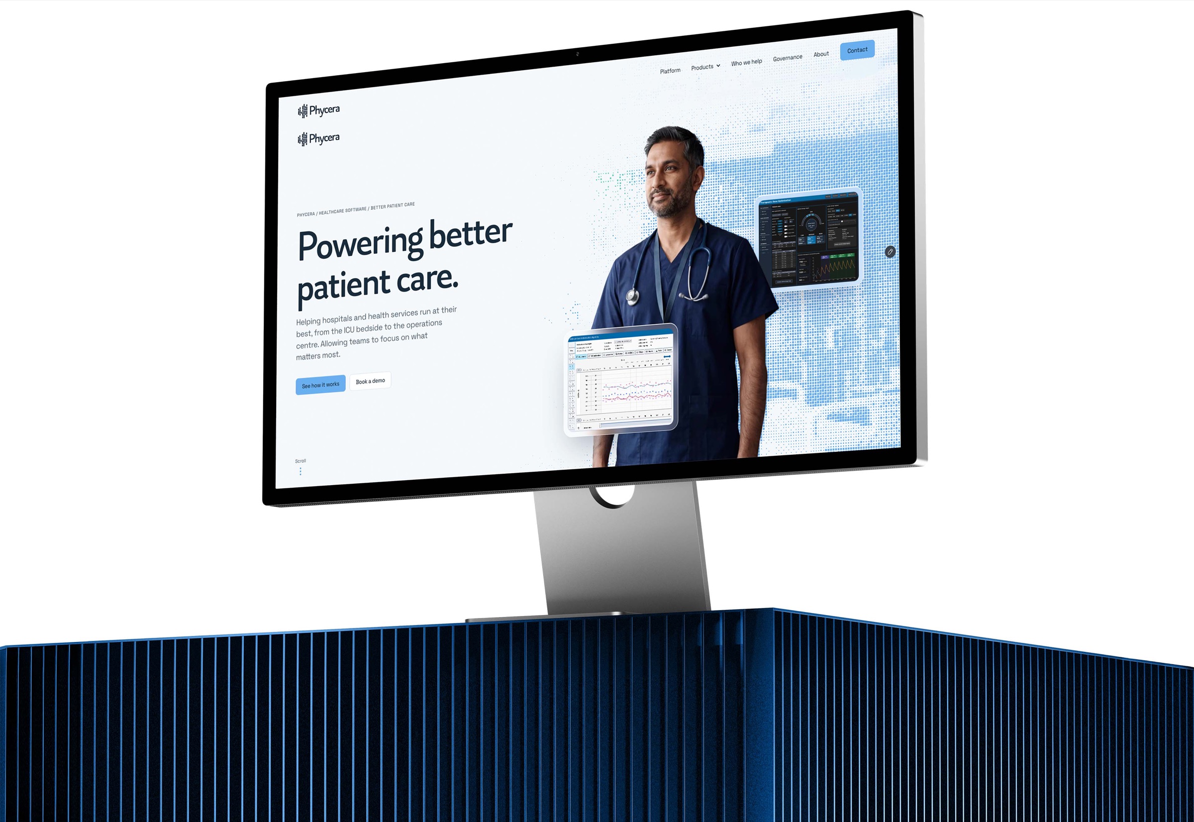
Understood in the first scroll.
The people who buy clinical software are short on time and wary of hype. The site is built so a reader knows what Phycera does, why it matters and why to trust it before they have scrolled very far.
Benefits before features.
The homepage opens on the outcome, better patient care, not the technology behind it. Every application is introduced by what it gives back to a clinician or a health service, in a single line, before any detail.
Impact as the proof.
Real figures from real wards do the persuading: a system in daily use since 2022, across 54 ICU beds and around 5,000 admissions a year. Numbers a reader can check carry more weight than adjectives.
The strategy in plain sight.
Connect, structure, present and protect gives readers one simple model to hang every product on. Governance and data security sit in the main navigation, because for a health service they are part of the decision, not the fine print.
- 01/CCISCritical care informatics at the ICU bedsideIn daily use
- 02/CareFlowReal-time visibility of patient movementIn co-design
- 03/TDOSafer, more precise drug dosingIn validation
- 04/RegistriesClinical registry reporting, compiled automaticallyIn use
- 05/CODEXAAI-assisted clinical coding and funding captureMarket ready
TBC: launch date and any early results.